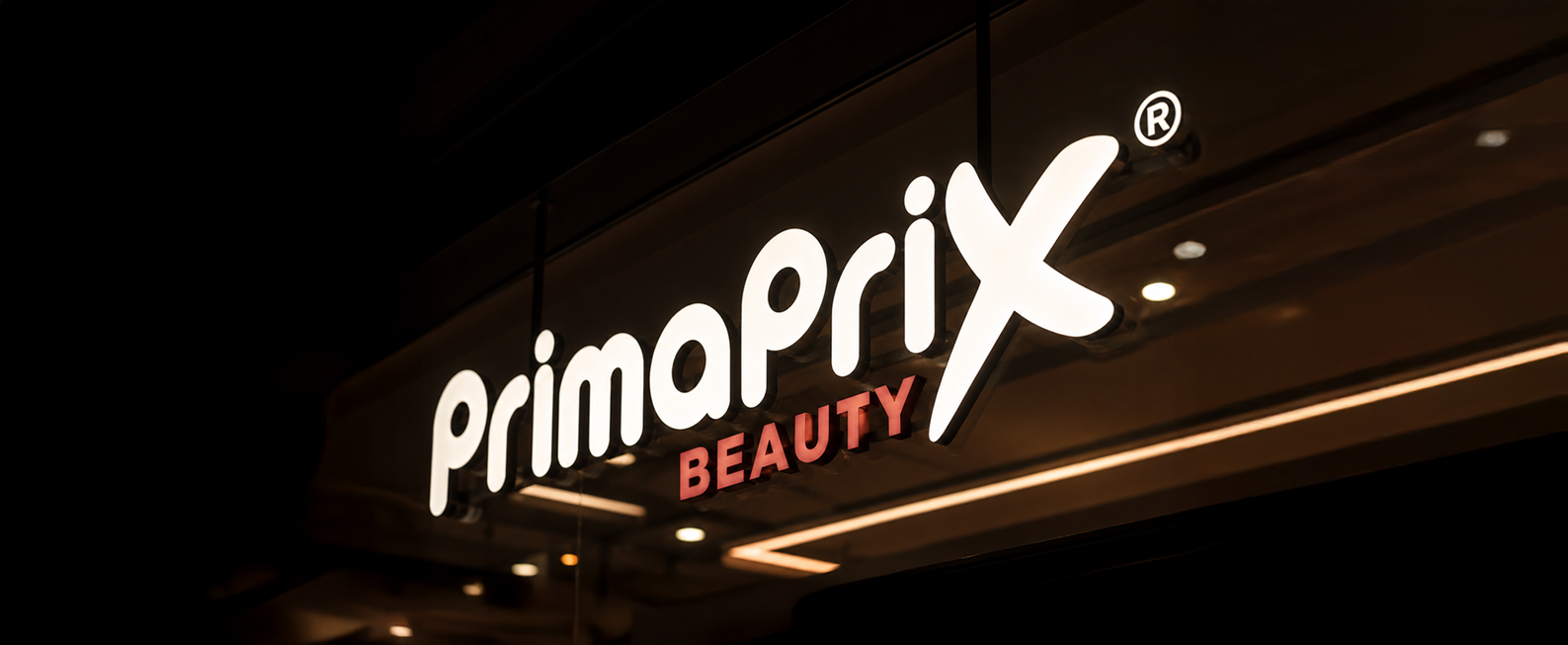
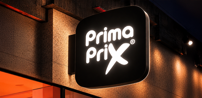
Primaprix
Info
Client Primaprix
Role Creative Director
Overview
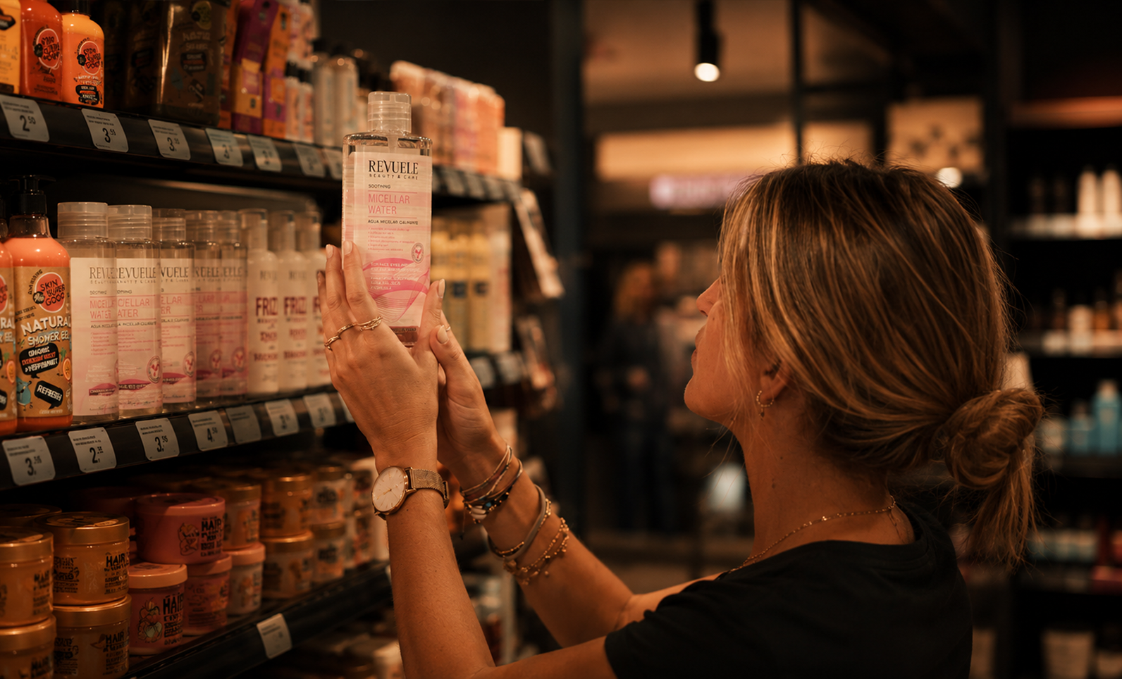
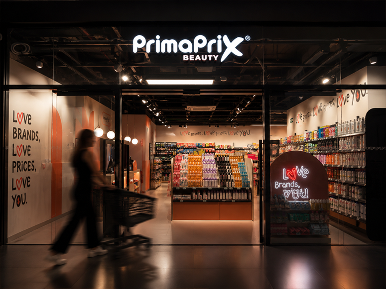
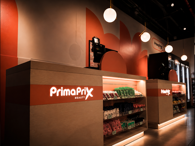
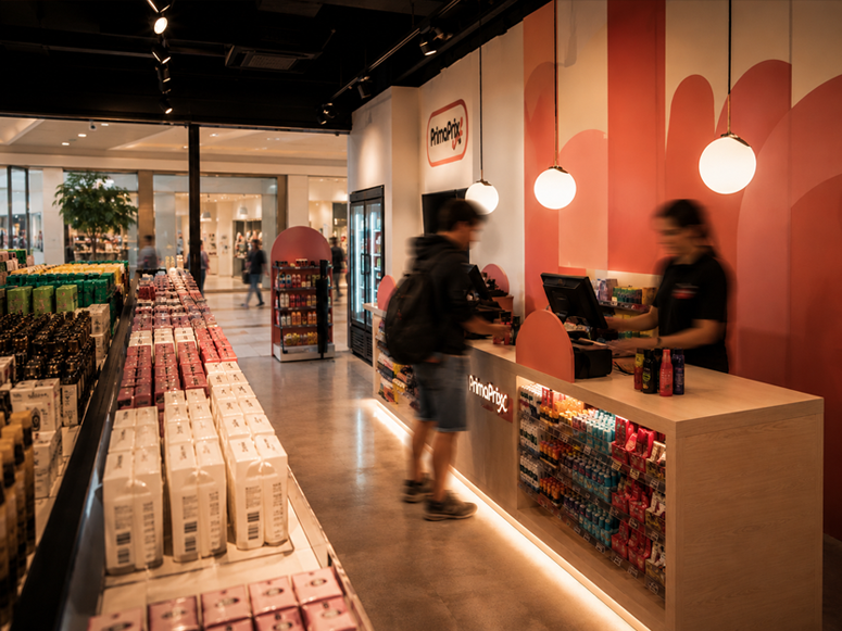
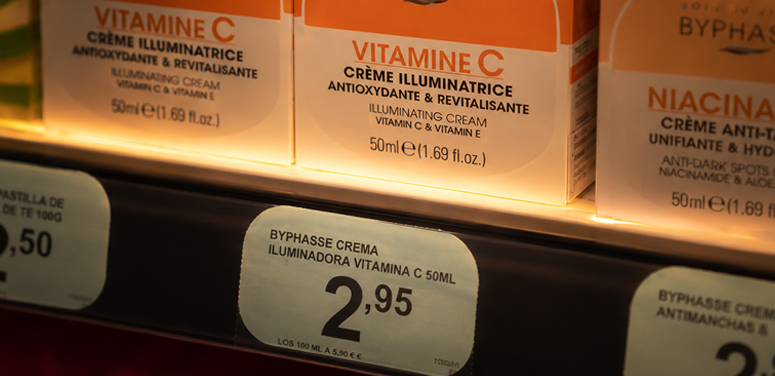
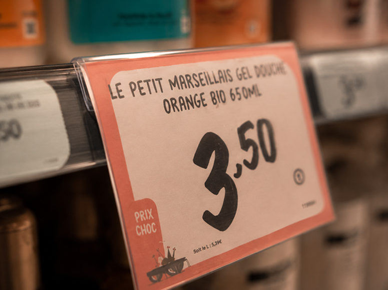
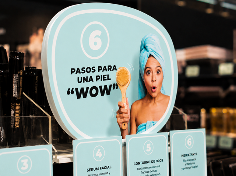
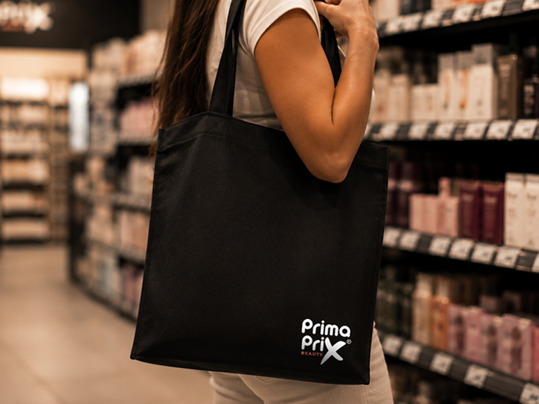
Primaprix is a retail concept developed around speed, accessibility and visual impact within the urban landscape of Madrid.
The project focused on creating a bold and recognizable visual system capable of translating the energy of contemporary discount culture into a more elevated and design-driven experience.
Through a combination of branding, digital direction and motion-led storytelling, the identity was designed to feel immediate, dynamic and highly memorable while maintaining clarity across physical and digital touchpoints.
The result is a visual language built to coexist between retail functionality and contemporary culture, transforming everyday shopping into a more immersive and emotionally recognizable experience.
Color Palette
A palette inspired by beauty and balance.
CORAL
#DB755A
ENERGY
WARMTH
CONFIDENCE
PINK
#F0CBC3
SOFTNESS
FEMININITY
ELEGANCE
PEACH
#ECB9A6
FRESHNESS
HARMONY
NATURAL
BLUE
#AFE3E6
CLEANLINESS
TRANSPARENCY
BALANCE
NEUTRAL
#F7F7F7
CALM
MINIMALISM
CLARITY


Typography
Clean.
Contemporary.
Confident.
Our typography combines clarity and sophistication to communicate beauty with confidence.
MONTSERRAT
ABCDEFGHIJKLMNOPQRSTUVWXYZ
abcdefghijklmnopqrstuvwxyz
1234567890 $%&@(*!.,:;#?)
MONTSERRAT ITALIC
ABCDEFGHIJKLMNOPQRSTUVWXYZ
abcdefghijklmnopqrstuvwxyz
1234567890 $%&@(*!.,:;#?)